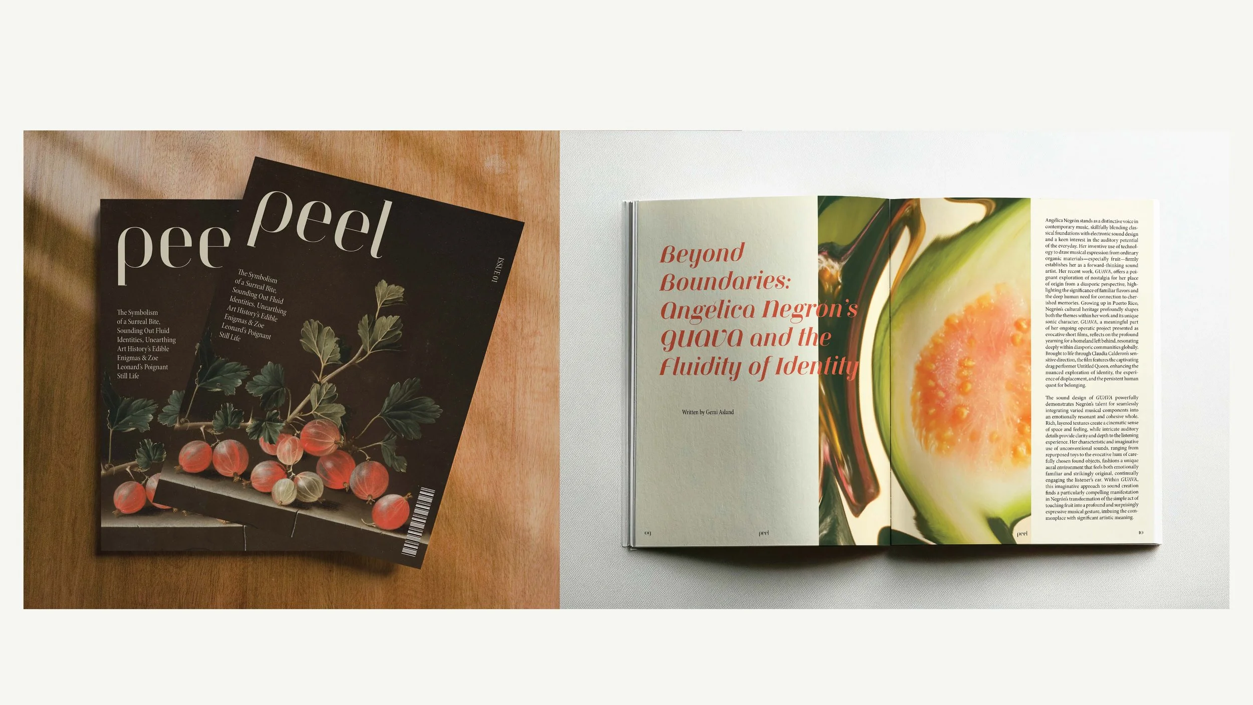
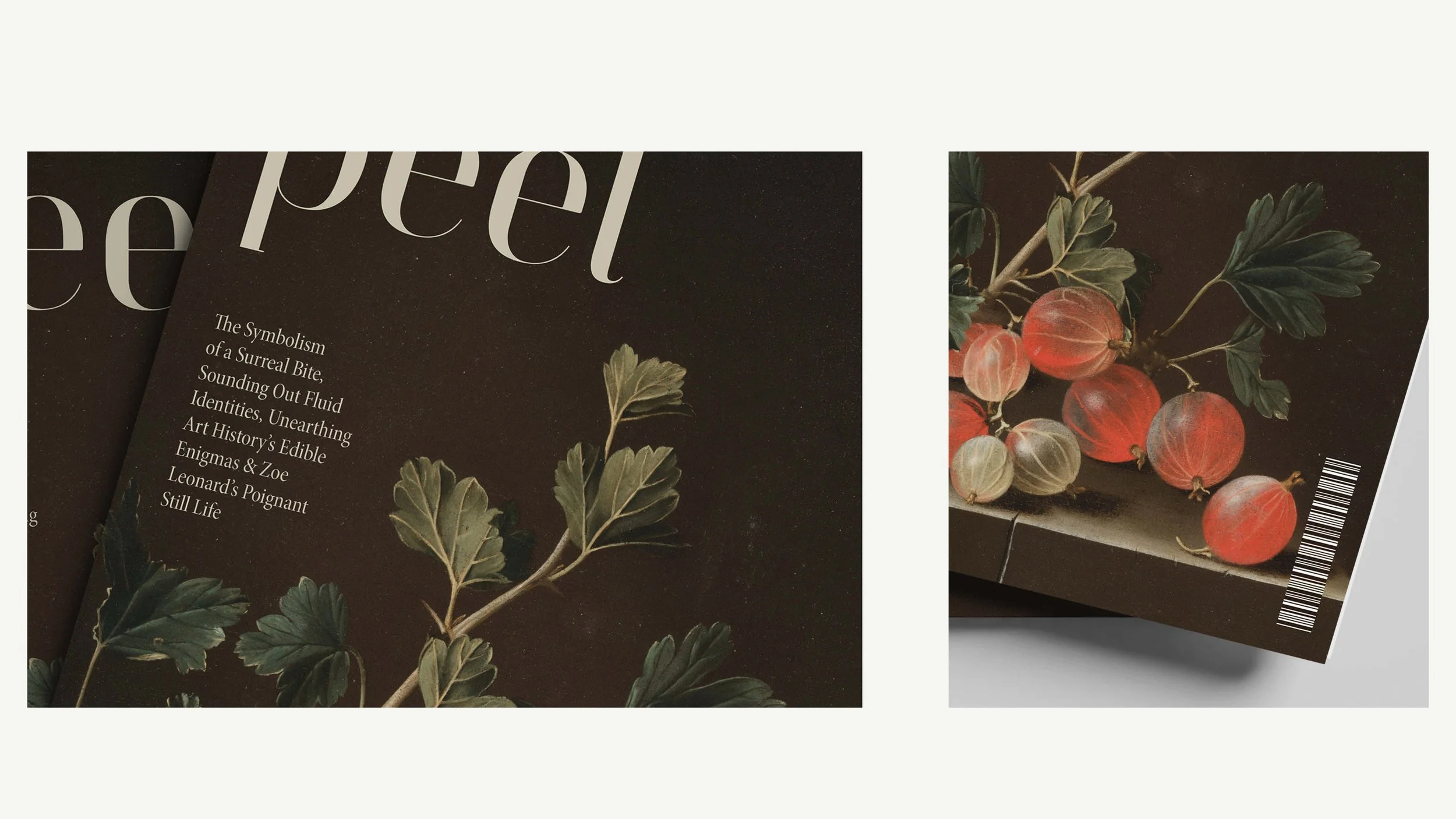
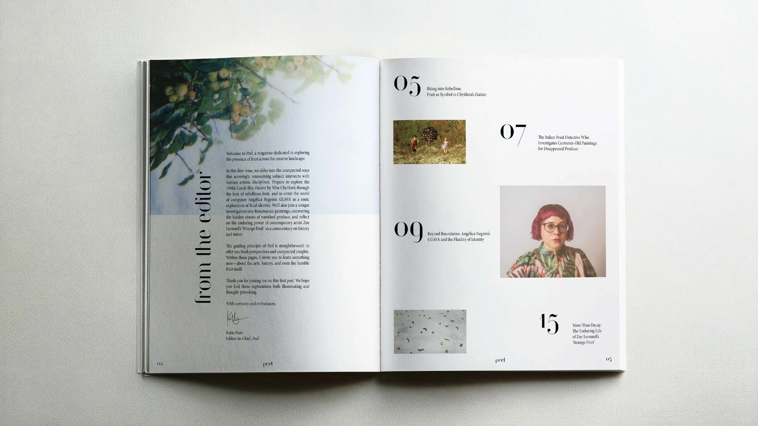
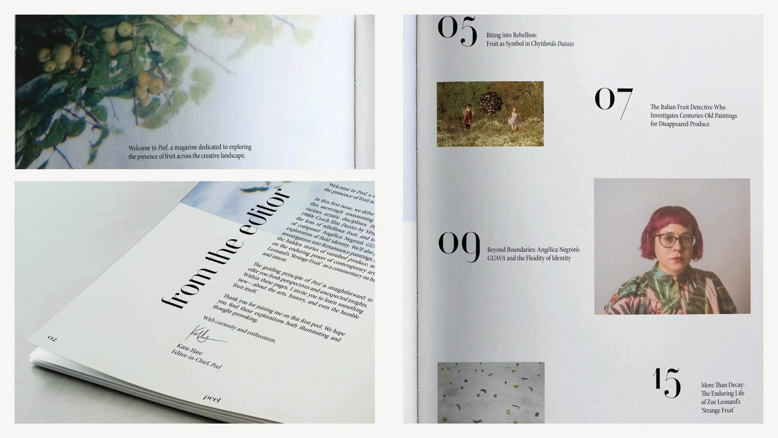
Peel
Peel is a fictional magazine I developed for my Typography course at MCAD (though I’d love to continue it as a real-world publication someday).
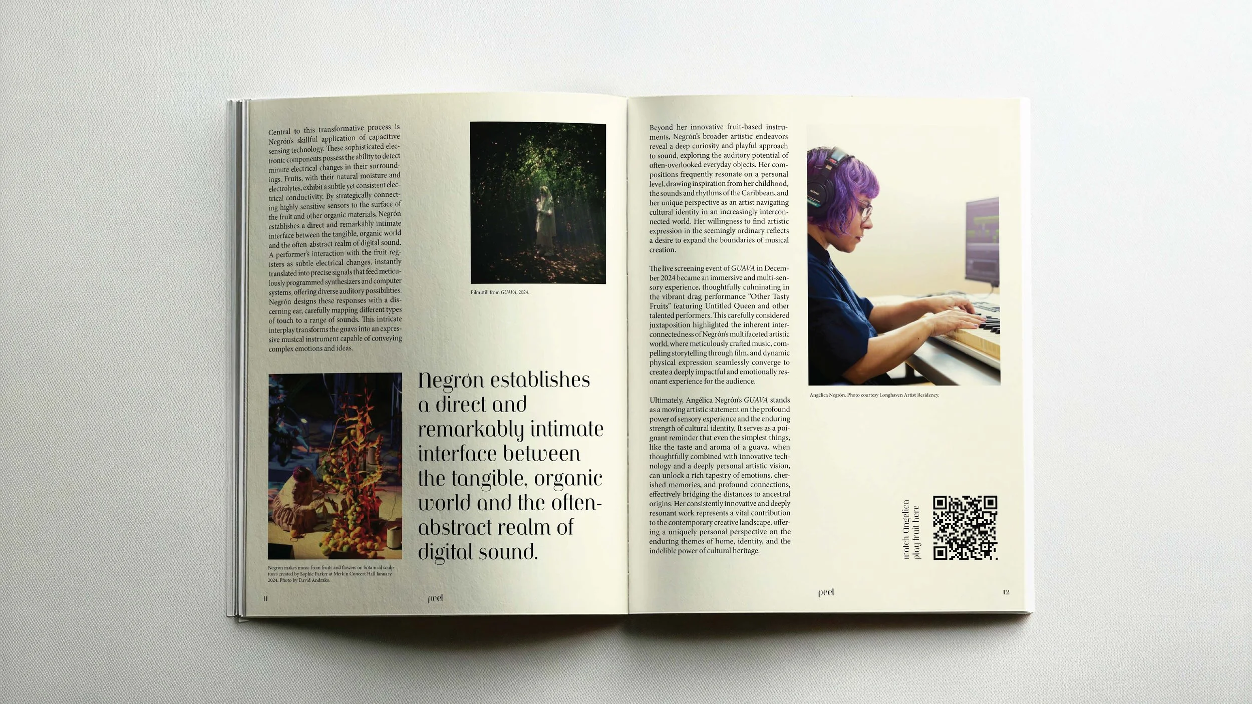
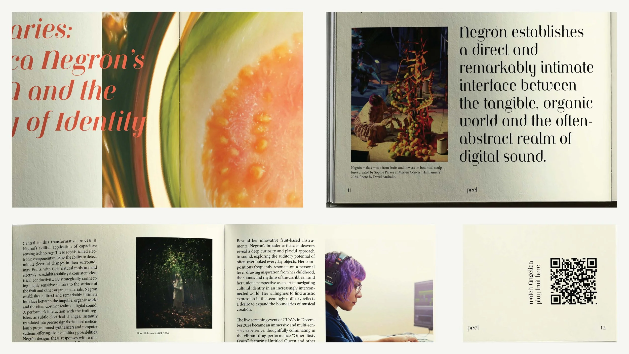
The project was an in-depth exploration of brand identity and layout design, starting with mood boards and comprehensive market and audience research. I then established a design system to create brand consistency and an intriguing visual language for a specific audience. I produced a masthead and logotype, a series of magazine spreads (table of contents, editor's letter, and a feature article), and a style guide to accompany the magazine. The final collection includes mockups showcasing a taste of the design and concept, with a focus on how typographic compositions marry type and image.


Concept
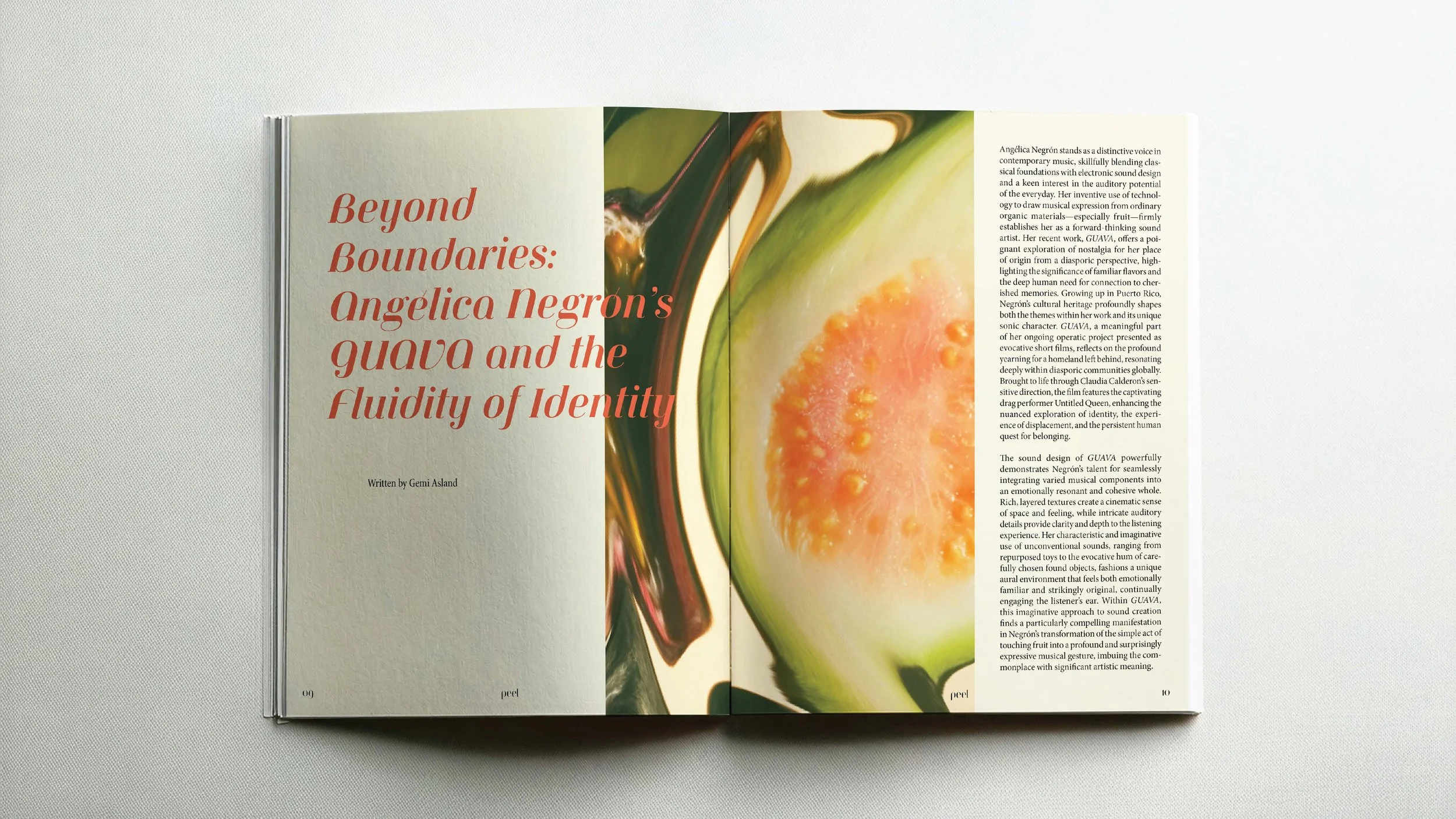
Peel explores the perhaps unexpected, yet undeniably present, influence of fruit across art, music, history, and culture. Produced quarterly, the magazine's guiding principle is straightforward: to offer fresh perspectives and unexpected insights through meticulous research and considered narratives. Within its pages, Peel invites you to learn something new—about the arts, history, and even the humble fruit itself. For those with an inclination to delve beyond the surface—be it the subtle symbolism in film, the obscure origins of musical motifs, or the nuanced impact of historical harvests—Peel presents a unique and visually compelling exploration.
Intent & Design Language
Peel’s design language is a blend of cohesive elegance and artistic experimentation. The magazine embraces a visually striking and refined aesthetic, highlighting the raw beauty and textures of its subjects. A rich interplay of typography, imagery, and color creates a unified brand identity, guided by a consistent yet flexible style that allows for a fresh experience for each issue.